


Honeycomb is an iOS app designed as a hub for Mary's Place Seattle to organize, explore, and share community resources. This was created as my graduate launch project at GIX, sponsored by Starbucks and Mary's Place. The objective was to help MP's Outreach and Diversion team more easily connect families in need with community resources.
Two 9-week Quarters
Lead Front-End Engineer / User Researcher
(Secondary Research, User Research, System Design, Product Design, Prototyping & Testing, Pitching, iOS Front-End Development)
-US Interagency Council on Homelessness
Mary's Place is a Seattle-based nonprofit dedicated to providing safety, stability, and hope to families experiencing homelessness. When they pitched their sponsored capstone in my graduate program, I immediately knew it was the project for me. I grew up lower income in rural West Virginia; this topic was near to my heart. More than anything, I wanted to apply my skills to something that would actually impact real people, not just build a flashy tech demo.
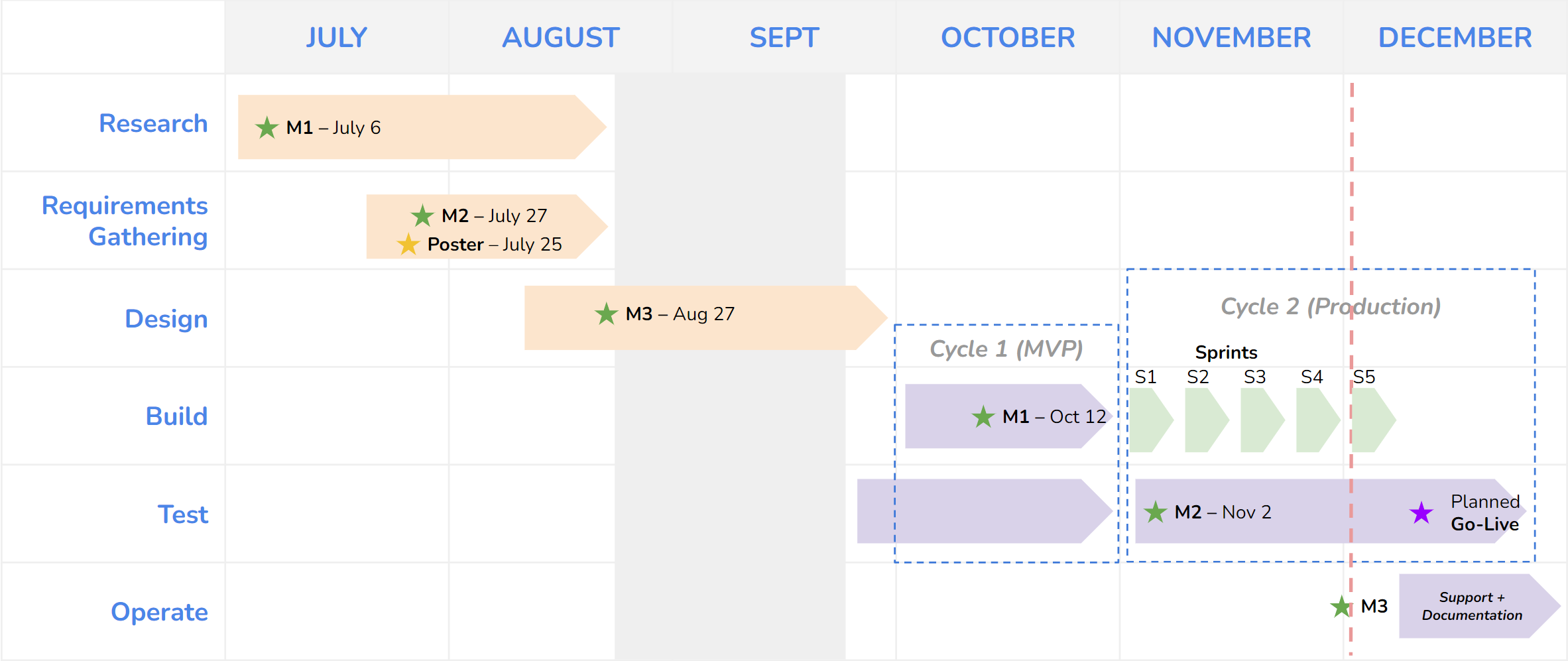
Families calling Mary's Place wait an average of 45 days before getting access to shelter. Our job was to lower this number. To identify bottlenecks, we first needed to understand MP's process. We began by combing through training materials and reports, and meeting with MP's Data Team. At this point, it was looking like our solution would be a new intake process that automatically matched families with eligible resources.
Create a user-flow diagram of the current process
Identify what slows outreach specialists down
Learn more about what resources are commonly needed
Understand how resource eligibility is determined
Scope where our solution will have impacts
Our first day of field research began with a contextual inquiry of an outreach request where specialists were assisting a family of ten living in an SUV. Next, we conducted an interview with the Outreach Team manager and a focus group with five team members. In these interviews we clarified processes and identified pain points. We also had interviewees annotate a print-out of our user flow diagram, fixing any mistakes and highlighting bottlenecks.
Knowing shelter capacity was a big issue for Outreach, so we met with Intake to learn how they manage this issue. We interviewed the Intake Line Manager and had her walk us through how she either refers families to Outreach or puts them on a shelter waitlist. We learned that Intake already has a shelter-matching system incompatible with Outreach's needs. Addressing this would be risky, organizational, and out of scope for our project.

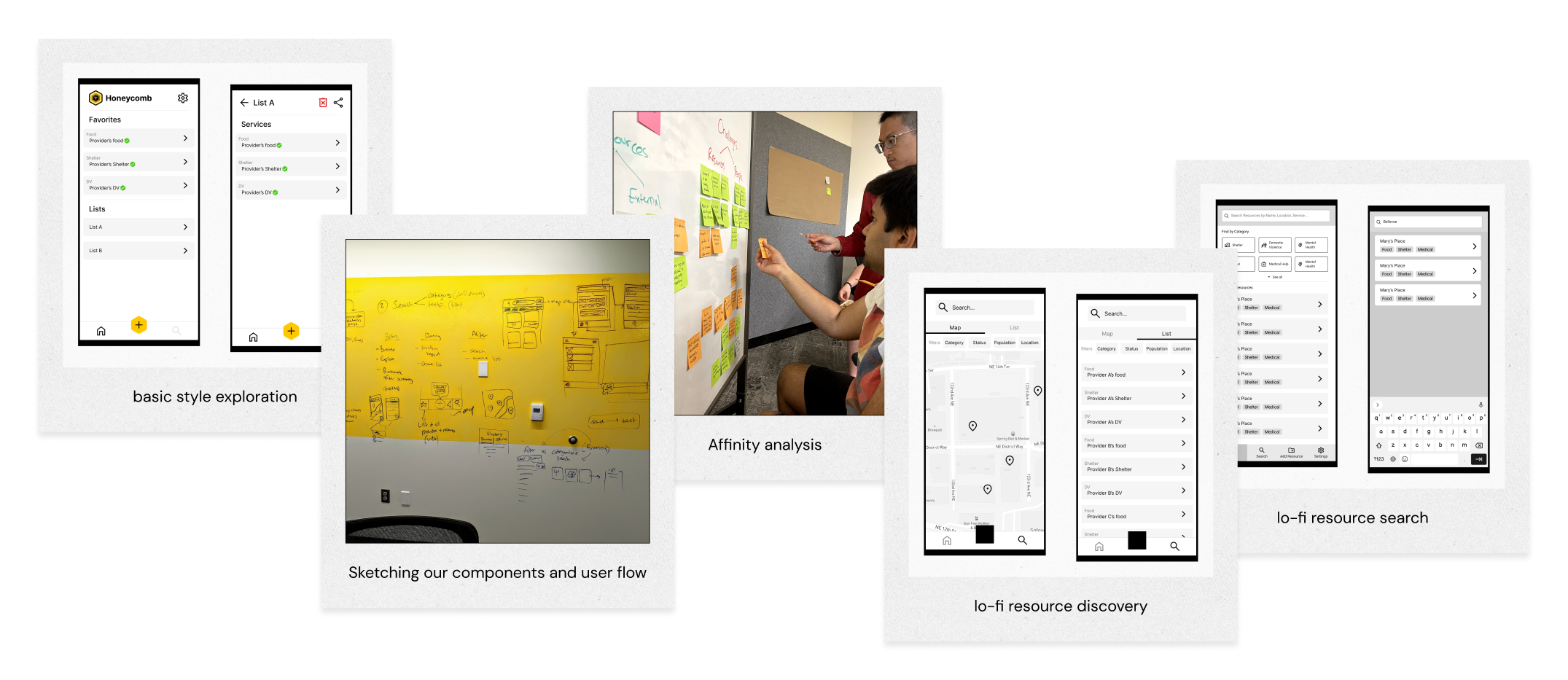
To process what we'd learned and identify patterns, we used an affinity analysis technique: sticky notes everywhere! We grouped our notes, labelled high-impact pain points, and discovered our problem.
With our problem identified, we needed to craft a solution. MP uses Microsoft Teams extensively so we initially considered building a chatbot to document and surface resource info in-chat, but this would require admin access we couldn't be granted. Instead, we landed on building an iOS app specialists could use to contribute to and pull from a shared database on their work iPhones.
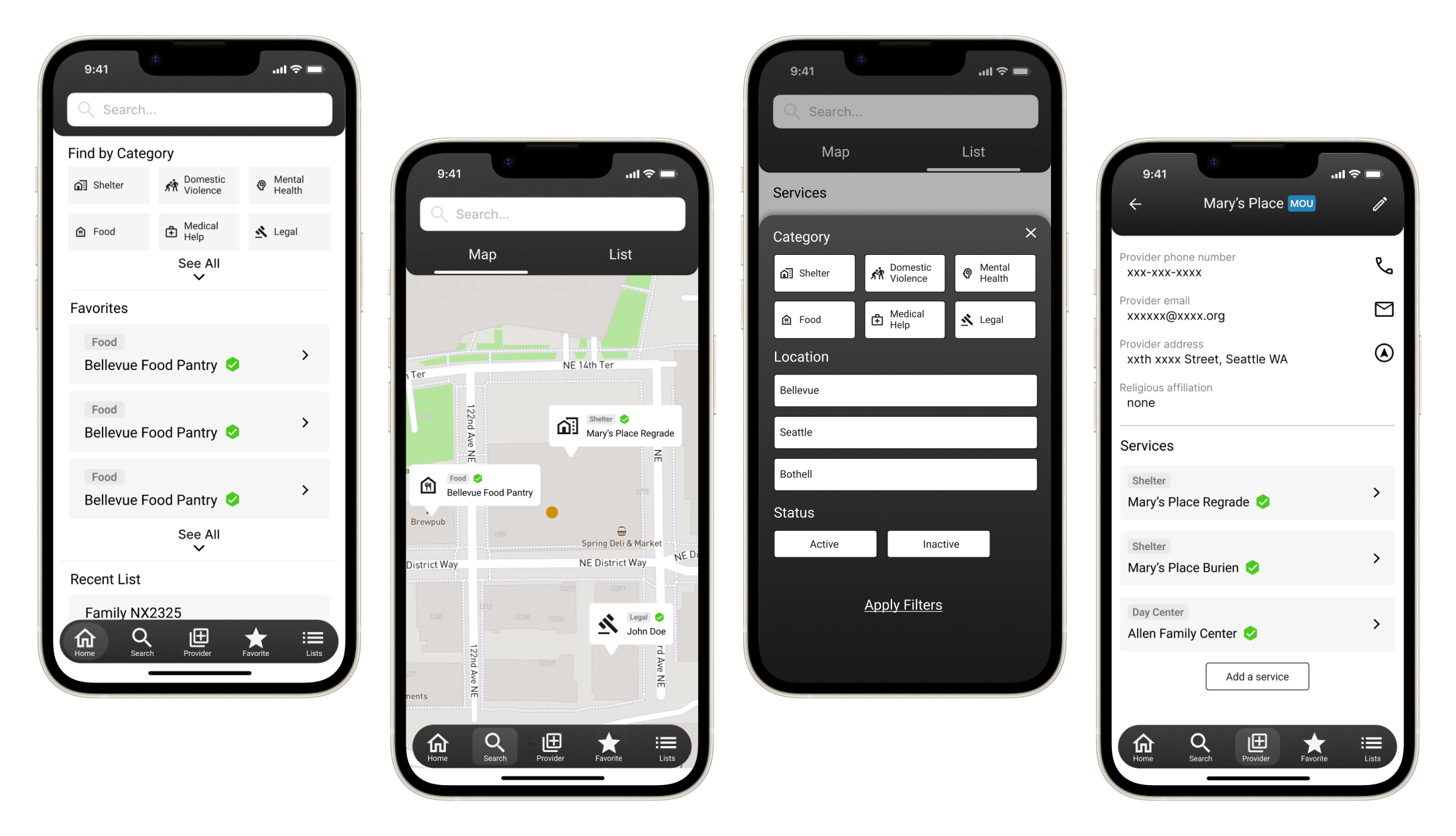
We paid another visit to the Outreach Team to test our prototype with five specialists. In our data model, we separated resources into 'providers' with multiple 'services'. Our primary testing goals were to confirm our value proposition, test our implementation, and determine whether this data model made sense to our users.

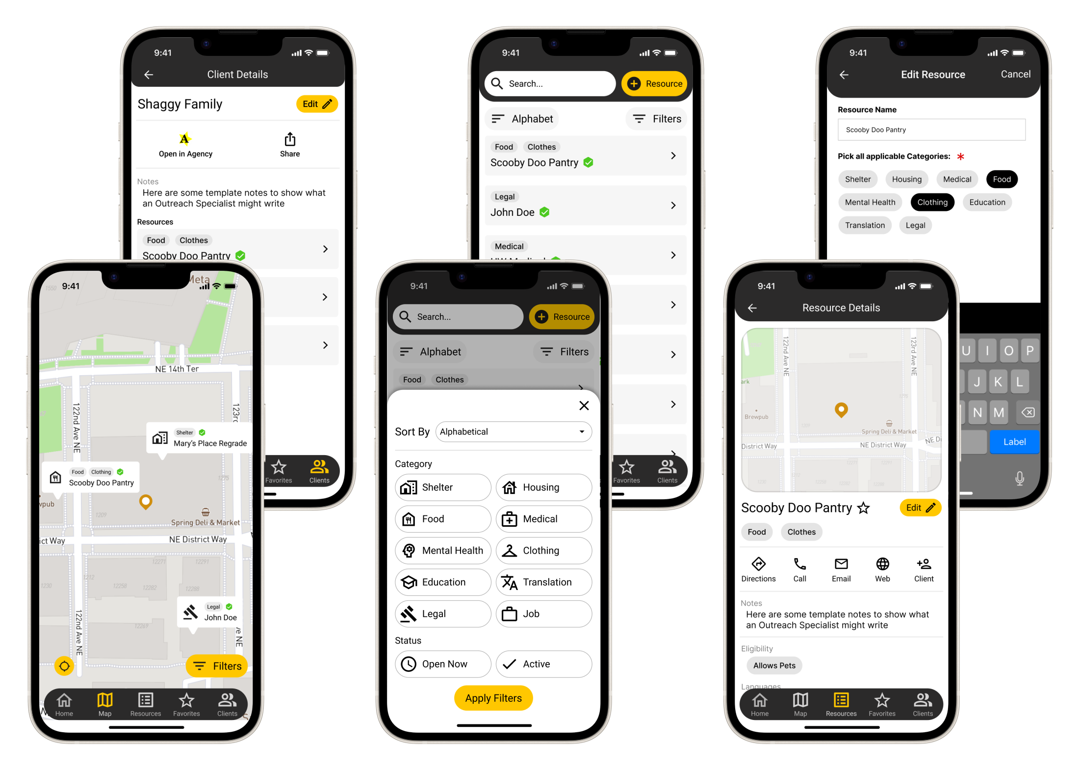
With our value proposition confirmed, this round of testing could help confirm what we changed from round 1, gauge top features and set development priorities.

-Outreach Specialist in Round 2
With satisfactory user testing results, it was time to lock down our features and start development. We decided to build our app using Flutter for three reasons: I was already familiar with it, it played nicely with Firebase and Google Maps APIs, and its cross-platform nature would make it easy to expand in the future.
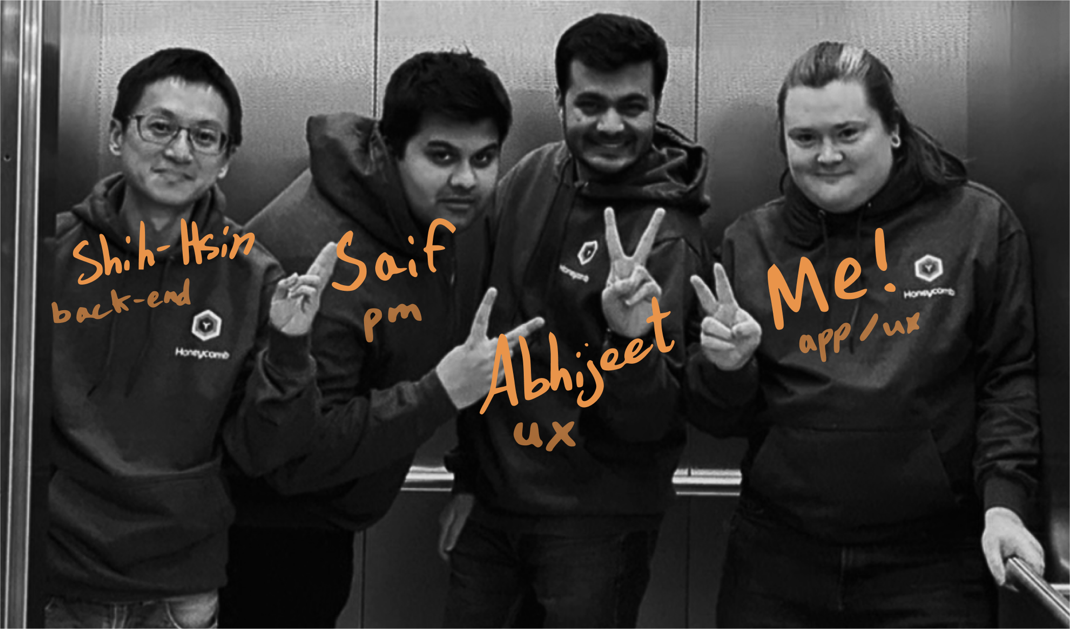
We had less than five weeks to go from a Figma prototype to a working app we could present and hand over to Mary's Place. To get this done we divided front-end and back-end tasks between myself and Shih-Hsin respectively, and split features into five weekly sprints. I would distribute a new build on TestFlight and Abhi and Saif would test for bugs on Fridays.
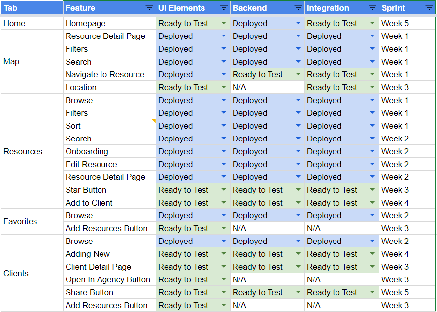
Our sprint-based development tracker
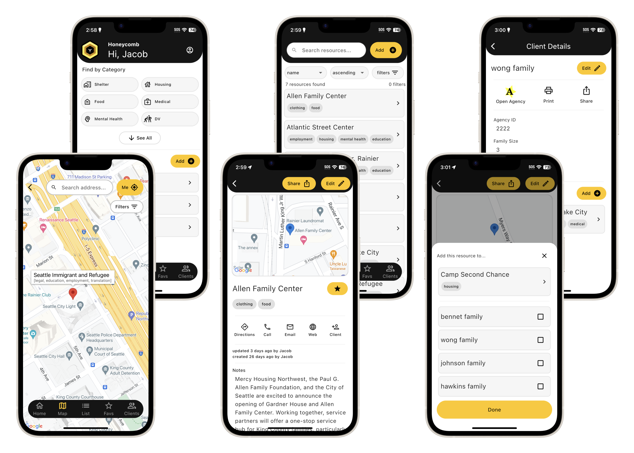
We finished core development early! With our extra time, we ran scripts to stress test our back-end and we manually onboarded over 130 verified local resources.
In mid-December 2022, we met with Mary's Place one last time to walk team members through our final app and hand over a folder with our research notes, code, and thorough documentation. The Mary's Place data team is working on an early 2023 internal rollout plan.
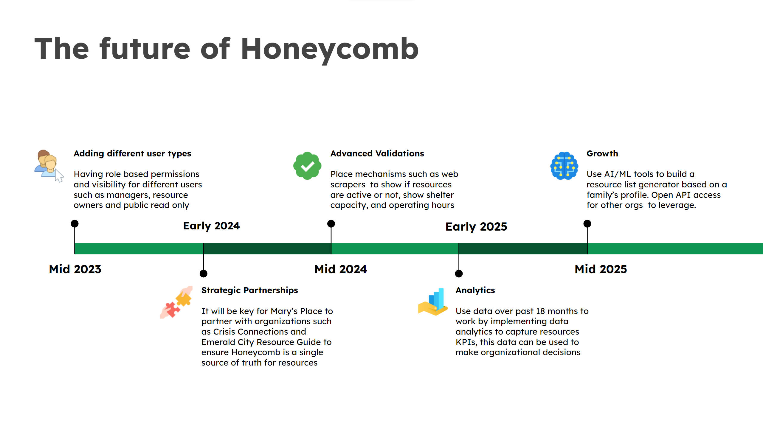
We also invisioned future expansions