

.
ND Connect is a virtual clubhouse and mentorship platform for neurodivergent adults to learn and grow together. We want to build a new kind of networking, accessible to everyone.
since April 2023
Co-founder, CTO
(user research, prototyping, design system, product design & strategy, front-end development, analytics, test development, product management)
-Mentor Canada, 2022
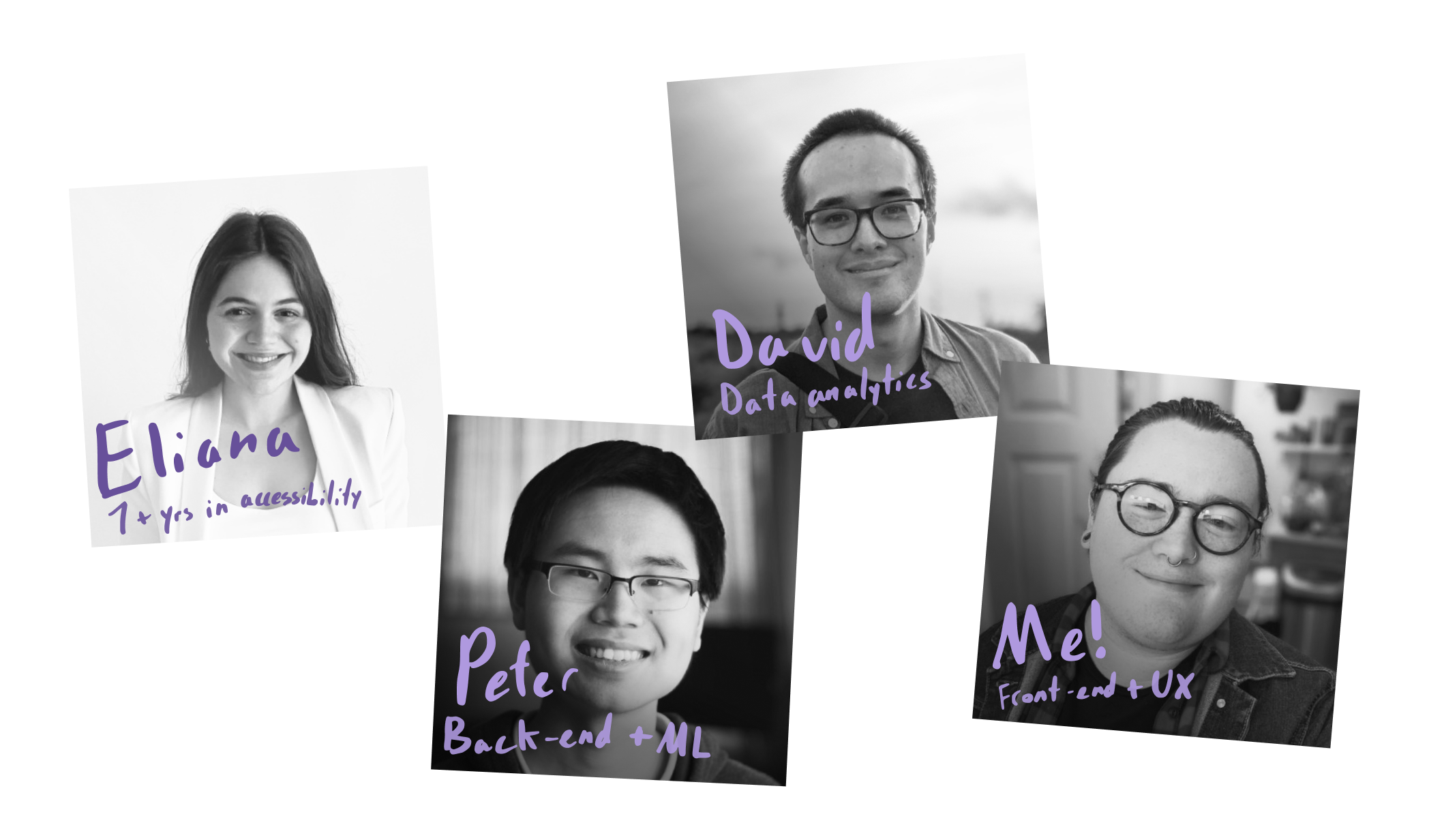
I'm autistic myself, and I've experienced firsthand how that can affect your social capital and, as a result, your career. I want to help build a new way to network, accessible to folks like me! I met Eliana from a LinkedIn post in early 2023, looking for co-founders to build this exact thing. She had been working with Peter on a neurodiversity-focused non-profit for a few years already.
React
Typescript
Nextjs
Chakra UI
Tanstack Query
Firebase Auth
FCM
Expo
React Native
Zustand
Playwright
Jest
PostHog
Socket.io
Stream Chat
Vercel
TipTap
Figma
Figjam
Linear
PWA
We started planning out ND Connect around May of 2023. Initially, we thought the core problem we needed to solve was helping people keep up with long term mentor/mentee relationships. We built our MVP around creating profiles, swiping Tinder-style on mentors, and booking meetings with them through our platform. We also set up a Slack community and weekly community hours for early testers to talk to us and each other, shaping what we built. We very quickly learned that THIS was the product, not a buggy hybrid of LinkedIn and Calendly. People connected, found friends, commiserated about job searching, and shared milestones with each other in our Slack. A few weeks in, and we knew we needed to bring our Slack community into our app.
We also heard loud and clear that many of our members were tired of swiping on people. It's association with dating apps just confused people. We added a search-based member directory, and rewrote our home screen from the ground up. Gone were the four big ugly buttons (as our designer, I'd been campaigning for this for a long time!), now our home screen highlighted what made our community special: the people.
As we approached our year mark, we got our first major competitor 💀. It was scary! They had investor money, experienced founders with a focus on marketing, and they already had a community feed. The timing was not ideal (I was about to move across the country, and one of my co-founders was starting a second job to keep us going), but we had to catch up. In all the frantic rush, we chose an existing community SDK that would become the bane of our existence for almost a year (do a lot of research and prototyping folks, tech debt sucks).
After adding the community and DMs came an admin portal for our university partners! Here, they could add events, resources, and announcements for their students to see in our main app. Faculty members could also register as 'allies' after a training. They show up to students using our platform, without getting access to our main app (we really want to keep our community members safe and private!).
In Spring of 2025, we really needed to replace our community/DMs stack. It was very limited and very buggy. We started off with a total rewrite of our DMs, using our own back-end, file uploads, and web-sockets. This was a big moment for us to prove to ourselves that, especially after making a choice we'd regret initially, we could deliver a solid technical product for our community. The new DMs got rave reviews! Messaging was fast, stable, and felt a lot more like the Slack community we were used to.
Now, we're working on rebuilding the community side of things, replacing our old stack once and for all! Wish us luck!
If you need to know more about ND Connect, please reach out to me!
